Sino-centric UX: Sociocultural Peculiarities in the Automotive Interface Design
Author: Martina Giberti

How localization shapes competitive user experiences
China has recently become a highly strategic partner and a crucial market for international business initiatives, especially concerning technological innovation. Nonetheless, together with this potential lies a crucial yet frequently underrated dimension: the linguistic and sociocultural peculiarities of the Chinese ecosystem, which play a pivotal role in shaping the consumer behavior, specifically when involving human-machine interaction.
Hence, this structural uniqueness should be considered when it comes to designing automotive Human-Machine interfaces (HMI) for the Chinese market, in the sake of optimizing user experience and product competitiveness.
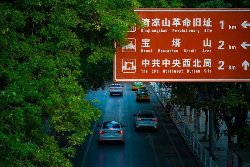
The Chinese language raise itself significant challenges for in-vehicle interface readability and design, as it employs a logographic writing system, composed of thousands of monosyllabic characters, each representing a single word (e.g. “车”= car). Being an isolating language, Chinese tends to produce shorter sentences than inflectional ones like italian, despite which its clauses are more visually complex and thus cognitively more demanding to read; a vivid example is that alongside a music icon, the Italian interface would employ the word “Musica” whilst the Chinese counterpart the character “音乐”.
Designing automotive user interfaces without considering the non-alphabetical nature as well as the square configuration of characters could have a plethora of complications in terms of alignment, content distribution and space organization.
A further aspect to consider is the input process: when typing, Chinese users do not write characters, but rather they use the pinyin system[1], which is then automatically converted into the appropriate character (e.g., they type “che” to obtain “车”).
In light of all these factors, the recommended typeface for digital interfaces is “Heiti”[2], font sizes should be larger (height of alphanumerical text to be at least 20 arc-minutes of visual angle) and communication much rather visual and mainly composed of icons and dynamic animations.
From a sociocultural perspective, China is defined as a high-context society, relying on obliqueness, concise information, and nonverbal communication patterns.
Interface usability, acceptance and behavioral consequences are significantly impacted by cultural semiotics as well: regarding numerology, 4,5,9 are to be avoided as related to inauspiciousness, whilst 2,7 are preferred as considered promising. The same applies to symbolism associated with colors: white and yellow should be eluded as associated with negativity, and inappropriate content respectively; red must be employed cautiously as it is associated with celebration and good luck.
Moreover, China is widely perceived as a collectivist society, in which interpersonal relationships are prioritized in both private and professional interactions, making the in-vehicle integration of vocal assistant a significant value added: the more animated and interactive the assistants, the more competitive and immersive the UX. Preferably, they are little anthropomorphic robots designed with a wide array of facial expressions or body movements; paradigmatic cases are the world’s first artificial intelligence vocal assistants, known as NOMI for NIO vehicles and XIAOP7 integrated in XIAOPENG automobiles.
To conclude, China represents a high-potential target audience, owing to its oppenness to innovation, experimental approaches and high purchasing power. Nevertheless, in the realm of the automotive HMI design, an insightful understanding of the underlying sociocultural and linguistic patterns is higlhy recommended in order to optimize the funcionality and readability of in-vehicle infotainment systems.
[1] The Pinyin is the standard system of romanized spelling for transliterating Chinese characters.
[2] In China, typeface is usually classified into Heiti typeface (Heiti) and Songti typeface (Songti). The most evident differences between those two tipologies are in the features of the beginning and ending of strokes, and turning points. Songti is comparable to serif typeface and prefertable for paper-based media, whilst Heiti is akin to sans-serife typeface.
Bibliography
NIO.com. (2020). Nomi – World’s first in-vehicle artificial intelligence.
Keep in contact.
If you are interested in collaborating with us or if you would like information about our services, please contact us and we will be happy to help. Let’s get in touch and make something great happen.